 +91 9787303699
 contact@amazefox.com
+91 9787303699
contact@amazefox.com
contact@amazefox.com
+91 9787303699
contact@amazefox.com
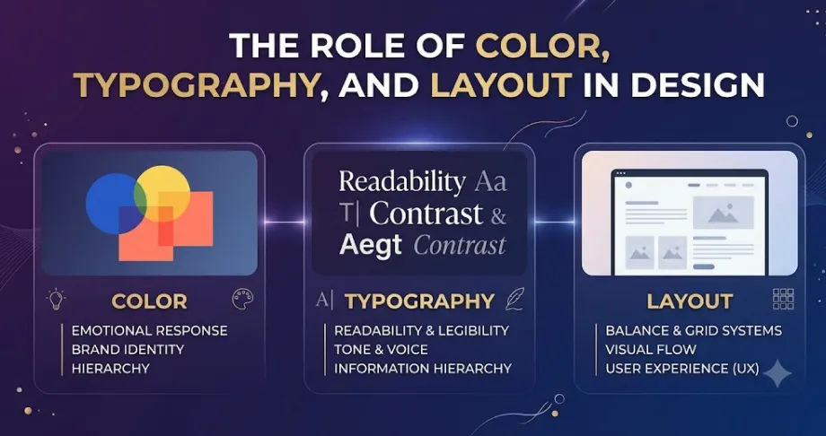
Good design is not only about making visuals look attractive. It is about presenting information in a clear,
engaging, and meaningful way. Among the many elements used in design, color, typography, and layout play a
major role in creating a strong visual experience.
These three elements work together to attract attention, communicate ideas, improve readability, and guide
people through the content. Understanding how to use them effectively can help create designs that are both
visually appealing and easy to understand.
Color is one of the first elements people notice in a design. It can influence emotions, create visual
interest, and help communicate a specific message.
Different colors can create different feelings and associations. For example, warm colors can create energy
and excitement, while Color tones may create a calm and professional feeling.
How Color Improves Design
However, using too many colors can make a design look confusing. A balanced and consistent color palette is usually more effective.
Typography focuses on how text is styled, arranged, and presented. It is important because text needs to be
both readable and visually appealing.
Font selection, size, weight, spacing, and alignment can all influence how people perceive and understand
information.
Why Typography Matters
Good typography should always prioritize readability. Decorative fonts may look attractive, but they should not make important information difficult to read.
Layout refers to how different elements are positioned and organized within a design. A well-planned layout
creates structure and helps guide attention.
A good layout ensures that elements such as text, images, headings, icons, and other visuals work together
rather than competing for attention.
Key Benefits of a Good Layout
Proper alignment and spacing are also important parts of an effective layout.
Color, typography, and layout should not be treated as separate elements. They work together to create a
complete visual experience.
For example, a strong heading can use typography to attract attention, color can highlight the heading, and
layout can position it where users naturally look first.
When these elements are balanced, the design becomes easier to understand and more visually engaging.
Visual hierarchy helps viewers understand which information is most important. Color, typography, and layout
can all be used to establish hierarchy.
A large heading can attract attention through size, a contrasting color can make an important element stand
out, and proper spacing can separate different sections.
This allows people to scan information quickly without feeling overwhelmed.
Even good design principles can become ineffective when they are overused.
Some common mistakes include:
Keeping the design simple and consistent can help avoid these problems.
To create a more effective design:
We hope these questions and answers guide you in choosing the right web design partner for your business’s digital transformation. If you have any more questions, feel free to reach out!

Color attracts attention, creates emotions, improves visual hierarchy, and helps communicate a specific mood or message.
Color, typography, and layout are three fundamental elements that shape the
overall quality of a design.
Color creates emotion and visual interest, typography improves communication and readability, whilelayout
provides structure and guides attention.
When these elements are carefully planned and balanced, they can transform a simple visual into a clear,
engaging, and effective design. Great design is not about adding more elements—it is about using the right
elements in the right way to communicate a message effectively.

Email us
support@amazefox.com

+91 9787303699

Teams
nikilfox / amazefox


Copyright 2025 © www.amazefox.com. All Rights Reserved.


