 +91 9787303699
 contact@amazefox.com
+91 9787303699
contact@amazefox.com
contact@amazefox.com
+91 9787303699
contact@amazefox.com
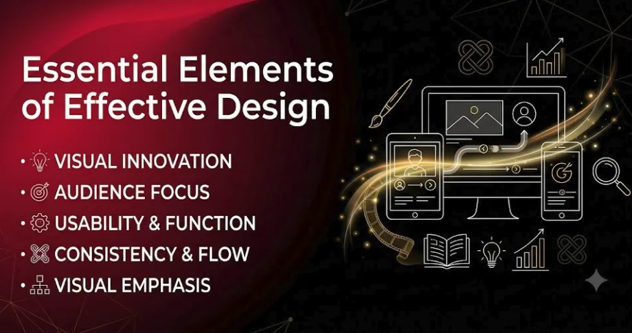
Effective design goes beyond simply making something visually appealing. Good design combines creativity,
clarity, functionality, and usability to communicate a message effectively. Whether it is a graphic, digital
interface, branding material, or visual content, the right design elements can make information easier to
understand and create a stronger visual experience.
Understanding the essential elements of design helps designers create work that is visually appealing,
organized, meaningful, and easy to use.
Color is one of the most noticeable elements of design. It can attract attention, create emotions, and help
communicate a particular mood or message.
Choosing the right color combinations can improve readability and create visual consistency. Designers
should consider contrast, color harmony, and the purpose of the design when selecting colors.
Typography focuses on how text is styled, arranged, and presented. The right typography can improve
readability while also adding personality to a design.
Font type, size, weight, spacing, and alignment should work together to create a clear and balanced visual
experience. Good typography helps users understand information quickly.
Layout determines how different elements are arranged within a design. A well-planned layout makes
information easier to follow and creates a sense of organization.
Proper alignment, spacing, and positioning can help guide the viewer's attention from one element to
another.
Visual hierarchy helps users understand which elements are most important. Designers can create hierarchy by
using different sizes, colors, fonts, positions, and levels of contrast.
For example, a large heading naturally attracts more attention than smaller supporting text. A clear
hierarchy makes content easier to scan and understand.
White space is the empty space between design elements. It does not necessarily have to be white; it simply
refers to areas without visual content.
Using enough white space can prevent a design from looking crowded. It also gives important elements room to
stand out and improves overall readability.
Balance creates visual stability within a design. Elements should be distributed in a way that feels
comfortable and organized.
Balance can be symmetrical or asymmetrical, depending on the style and purpose of the design. A balanced
composition can make visuals feel more professional and appealing.
Contrast helps different elements stand out from each other. It can be created through differences in color,
size, shape, font weight, or spacing.
Effective contrast improves readability and directs attention toward important parts of the design.
Consistency creates a unified visual experience. Using similar colors, typography, spacing, shapes, and
visual styles throughout a design helps everything feel connected.
Consistent design also makes information easier to understand and creates a more polished appearance.
Images, icons, illustrations, shapes, and graphics can make information more engaging. Visual elements
should support the message rather than distract from it.
Relevant and high-quality visuals can help explain ideas, attract attention, and make content easier to
remember.
Effective design does not always require many visual elements. A simple design can often communicate a
message more clearly.
Removing unnecessary elements and focusing on the most important information can make the overall experience
cleaner and easier to understand.
Usability focuses on how easily people can understand and interact with a design. A visually attractive
design may not be effective if it is confusing or difficult to use.
Designers should consider the user's needs and create experiences that are intuitive, accessible, and
comfortable.
Design should have a clear purpose. Every element should contribute to the overall goal rather than simply
being added for decoration.
A successful design combines visual appeal with functionality, ensuring that the design not only looks good
but also works effectively.
The strongest designs use multiple elements together rather than relying on just one. Color can attract
attention, typography can improve readability, layout can organize information, and visual hierarchy can
guide users.
When these elements are carefully balanced, the result is a design that is both visually appealing and
functional.
We hope these questions and answers guide you in choosing the right web design partner for your business’s digital transformation. If you have any more questions, feel free to reach out!

The key elements include color, typography, layout, visual hierarchy, white space, balance, contrast, consistency, imagery, simplicity, usability, and functionality.
Effective design is created through a combination of color, typography, layout, visual hierarchy, white
space, balance, contrast, consistency, imagery, simplicity, usability, and functionality.
The goal of good design is not simply to make something beautiful. It is to communicate clearly, guide
attention, improve understanding, and create a positive visual experience.
By understanding and applying these essential design elements, designers can create work that is creative,
meaningful, user-friendly, and effective.

Email us
support@amazefox.com

+91 9787303699

Teams
nikilfox / amazefox


Copyright 2025 © www.amazefox.com. All Rights Reserved.


