 +91 9787303699
 contact@amazefox.com
+91 9787303699
contact@amazefox.com
contact@amazefox.com
+91 9787303699
contact@amazefox.com
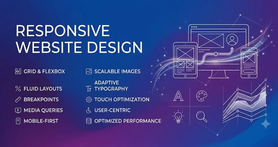
People no longer access websites from only desktop computers.
Today, customers may discover a business through a smartphone, research it on a tablet, and later visit the
website from a laptop.
This makes responsive design an essential part of modern digital experiences.
Responsive design means creating a website that adapts its layout and content to different screen sizes.
Instead of creating completely separate experiences, the design adjusts according to the device.
This can include changes to:
A visitor using a smartphone should not need to zoom, scroll horizontally, or struggle to click small
buttons.
Important information should remain accessible and readable.
A strong mobile experience makes it easier for customers to interact with a brand wherever they
are.
Responsive design helps maintain brand consistency.
Your website should still feel like the same brand whether someone visits from:
The layout may change, but the identity and core experience should remain consistent.
People use their devices differently.
Mobile users may be looking for quick information, directions, contact details, or a specific
service.
Desktop users may spend more time exploring detailed information.
Good responsive design considers these behaviours without making the experience complicated.
A poorly adapted website may have:
These problems can negatively affect how visitors perceive the business.
We hope these questions and answers guide you in choosing the right web design partner for your business’s digital transformation. If you have any more questions, feel free to reach out!

It means designing a website that adapts to different screen sizes and devices.
Responsive design is no longer an optional visual feature.
It is an important part of creating a modern website that can communicate effectively with customers across
devices.
One brand. One experience. Every screen.

Email us
support@amazefox.com

+91 9787303699

Teams
nikilfox / amazefox


Copyright 2025 © www.amazefox.com. All Rights Reserved.


